How it works
Install your Child Theme
Use Blocks
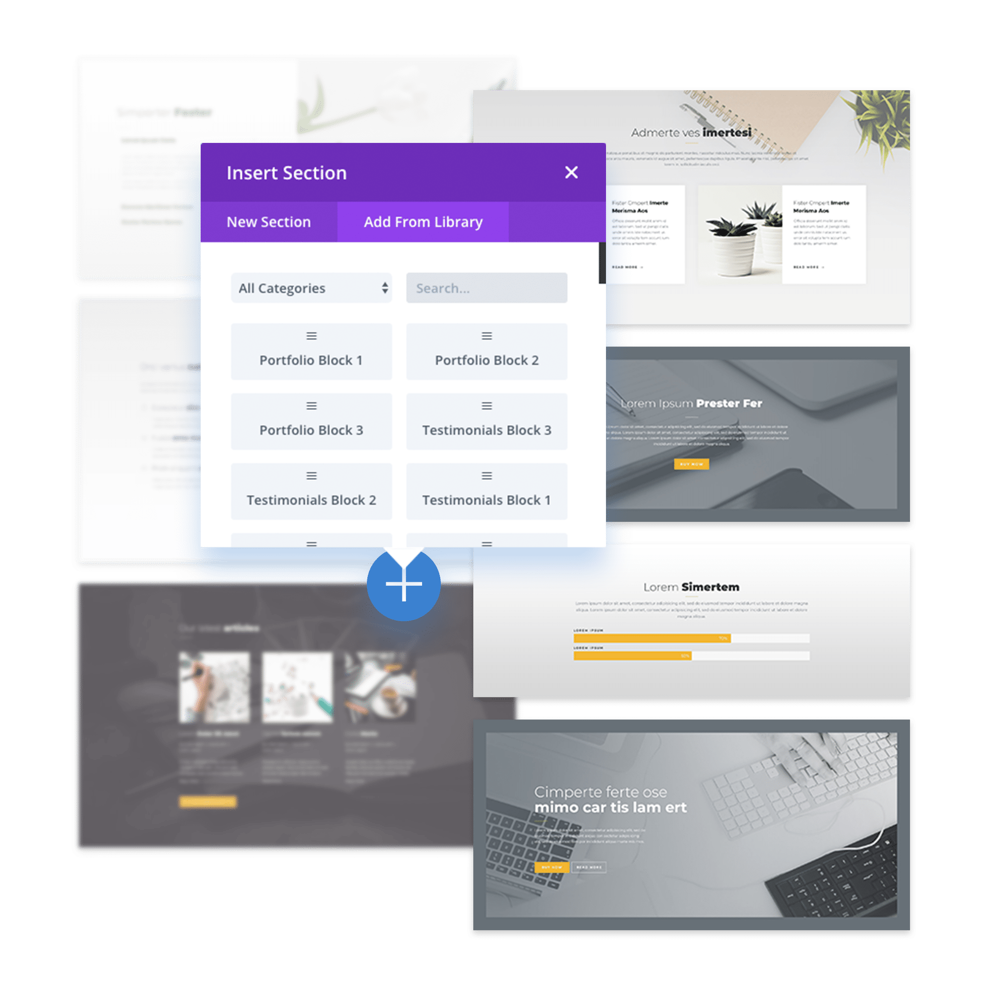
If you already have wireframes, or you want to just jump-in to building your site, follow these steps::
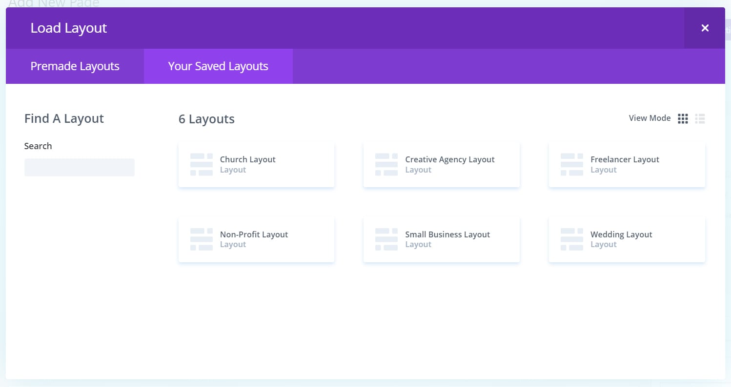
- Edit Curent Homepage activating the visual builder
- Delete curent sections
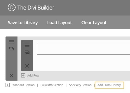
- Click on blue + sign to add an object
- Go to “add from library”
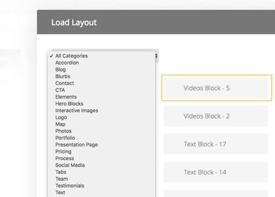
- Search for the block you like
- Add it to your page
- Enjoy Customizing it!
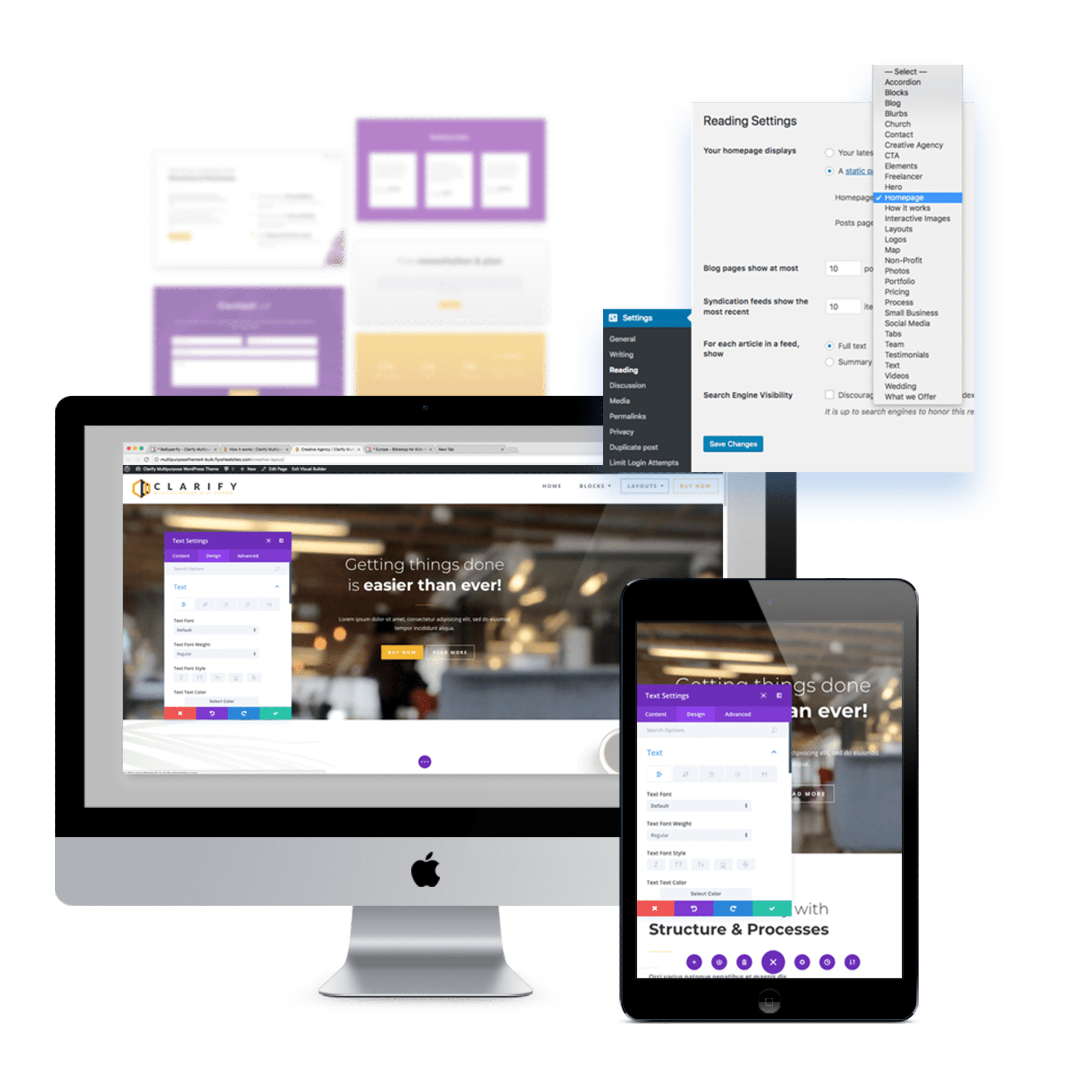
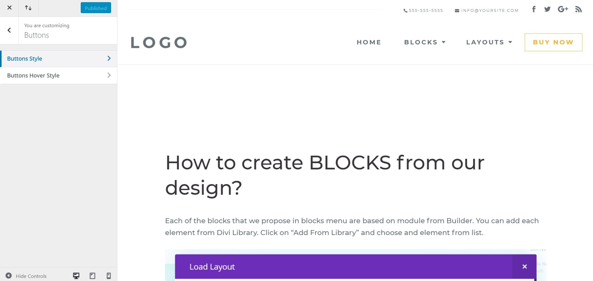
Use Layouts
You can easily activate one of our pre-made homepage Layouts to be your homepage, following these next steps:
- Choose which Layout fits best to you
- Go to the WordPress Dashboard
- Go to Settings > Reading
- Change the Homepage to the page you want
- Go to that page to edit it
- Enjoy Customizing It!
How to add blocks?
What Custom CSS Classes are we using?
How to create a Mega Menu?
How to change fonts and colors?
How to customize a block?
How to customize a Layout?
What sizes to use for images?
How to add blocks?
There are multiple ways to use blocks. What we are going show you is a way to be sure blocks work best. Customize your blocks, save them, and they will look great.
Build Your Wireframe
Maybe you already have wireframes; if not, you can start writing on a paper what sections you want to build on your website.
Pick Perfectly Suited Blocks
Start Building
Once you have a clear idea about the blocks you will use, it’s time to get them together. Follow the next 4 steps to build your pages:
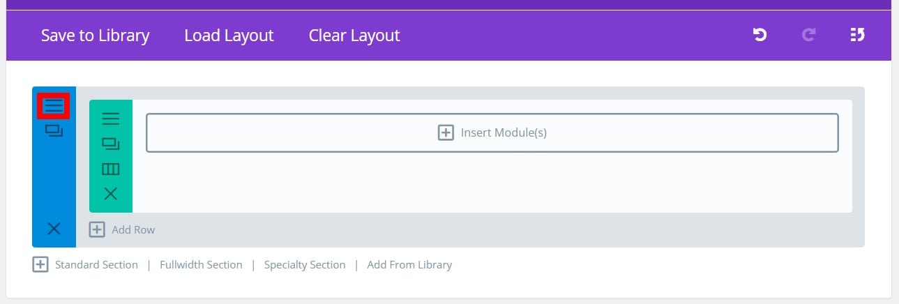
1. Create a new page
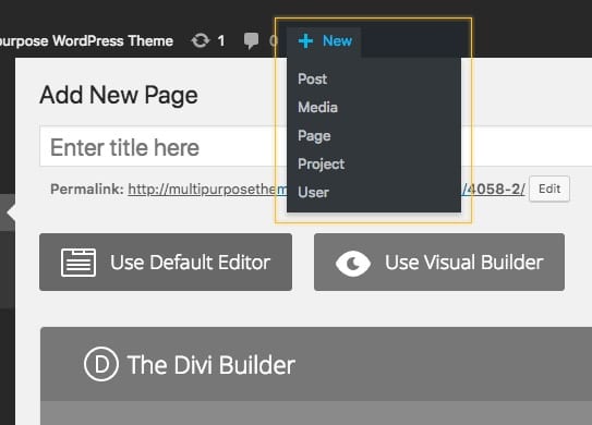
2. Use The Divi Builder
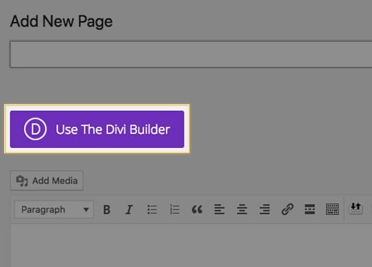
3. Click on Add from Library
4. Insert Blocks to your page
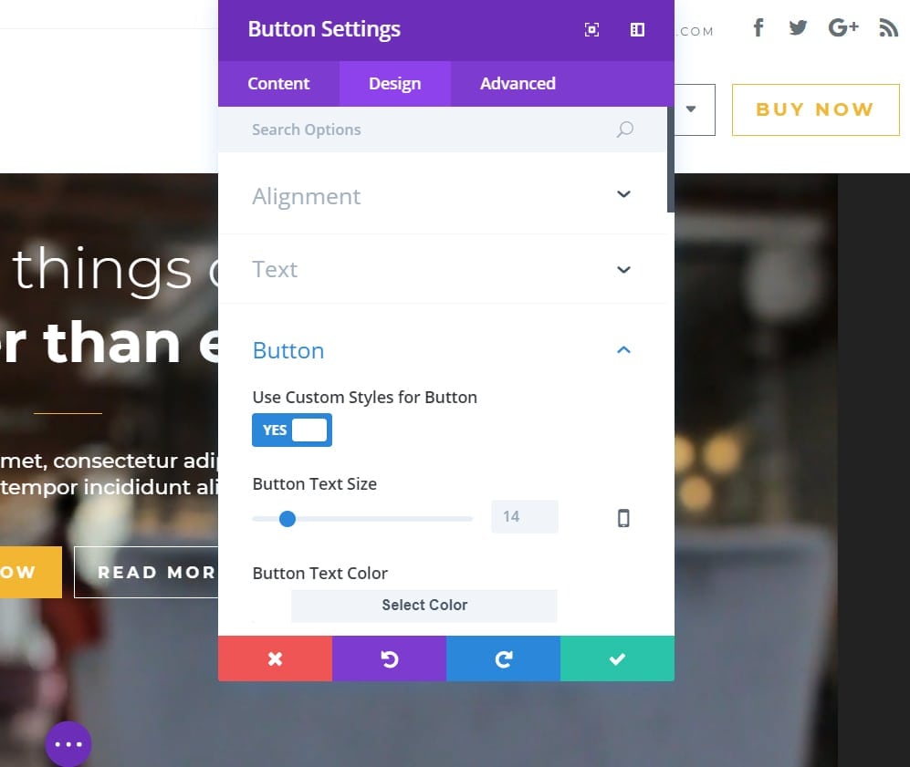
Customize each block
You can do the customization in the Divi Builder or in the Divi Visual Builder.
What Custom CSS Classes are we using?
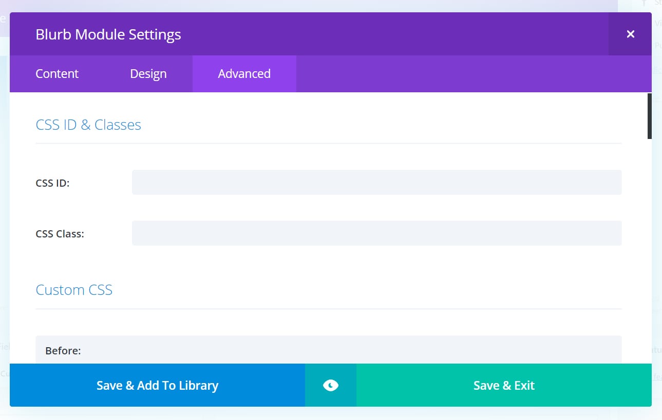
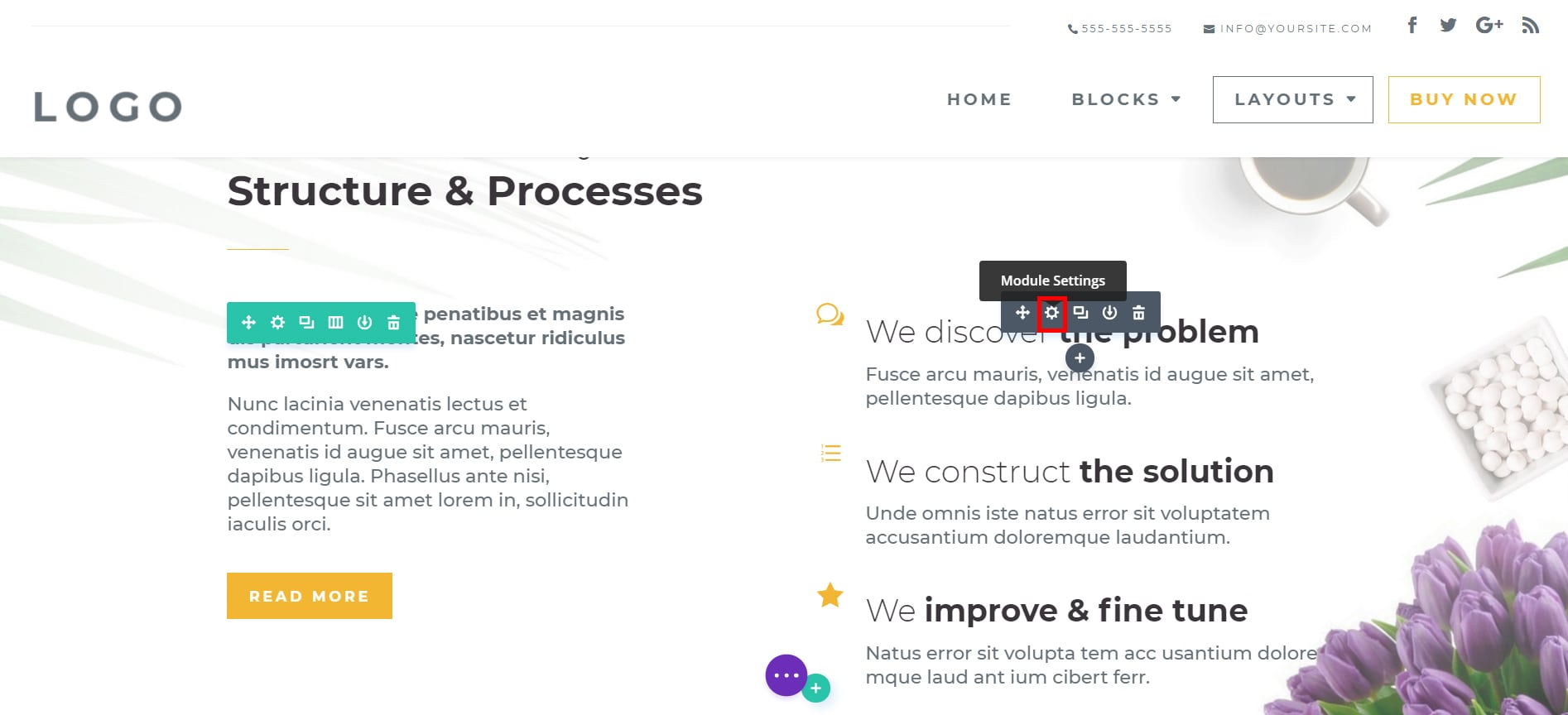
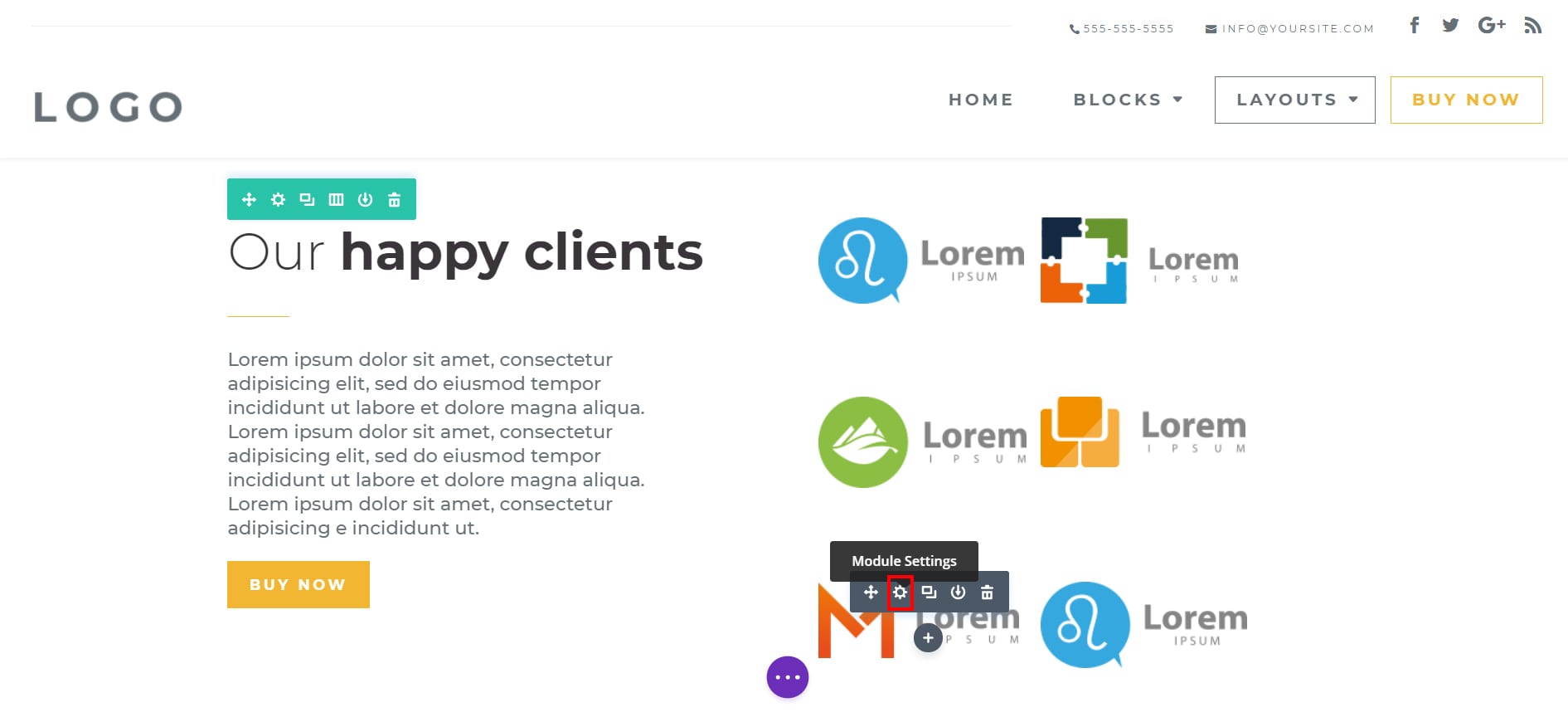
Some of the blocks have specifics classes. If you want to know what classes are related to what module, follow these next steps:
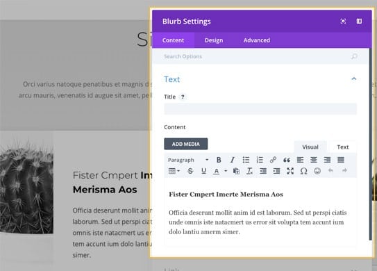
1. Go to Module Settings
2. Go to the Advanced Tab
Here are the classes for Hero Blocks, these need to be placed in the SECTIONS SETTINGS (by default, they are):
- hero_section1
- hero_section2
- hero_section3
Here are the classes for the Blurbs Blocks, these need to be placed in the SECTIONS SETTINGS (by default, they are):
- blurbs1
- blurbs2
Here are the classes for the Interactive Image Blocks, these need to be placed in the SECTIONS SETTINGS (by default, they are):
- interactive_images1
- interactive_images2
- interactive_images3
Here are the classes for the Logos Blocks, these need to be placed in the SECTIONS SETTINGS (by default, they are):
- logo1
- logo2
- logo3
Here are the classes for the Accordion Blocks, these need to be placed in the SECTIONS SETTINGS (by default, they are):
- accordion1
- accordion2
- accordion3
Here are the classes for Tabs Blocks, these need to be placed in the SECTIONS SETTINGS (by default, they are):
- tabs1
- tabs2
- tabs3
Here are the classes for the Blog Blocks, you need to have them in ROWS SETTINGS:
post_slider_content
- post_grid_bottom
Here are the classes for the Team Blocks, these need to be placed in the SECTIONS SETTINGS (by default, they are):
team_one
- team_two
- team_three
Here are the classes for the Testimonials Blocks, these need to be placed in the SECTIONS SETTINGS (by default, they are):
- testimonial_bottom
Here are the classes for the Pricing Blocks, needed for the Pricing Block MODULES, these need to be placed in the SECTIONS SETTINGS (by default, they are):
- custom_pricing1
- custom_pricing2
- custom_pricing3
Here are the classes for the Portfolio Blocks, these need to be placed in the SECTIONS SETTINGS (by default, they are):
- portfolio_one
- portfolio_two
- portfolio_three
Here are the classes for Elements Blocks, these need to be placed in the SECTIONS SETTINGS (by default, they are):
- numbers_section
- countdown_section
- graphics_section
Here are the classes for the Social Media Blocks, these need to be placed in the SECTIONS SETTINGS (by default, they are):
- social_buttons_bottom
- social_right
- social_bottom
Here are the classes for Map Blocks, these need to be placed in the SECTIONS SETTINGS (by default, they are):
- map_left
- map_right
- map_center
Here are the classes for the Contact Blocks, these need to be placed in the SECTIONS SETTINGS (by default, they are):
- contact_form_right
- contact_form_left
- contact_form_center
Here are the classes for the Process Blocks, these need to be placed in the SECTIONS SETTINGS (by default, they are):
- number_counter_top
- number_counter_middle
- number_counter_bottom
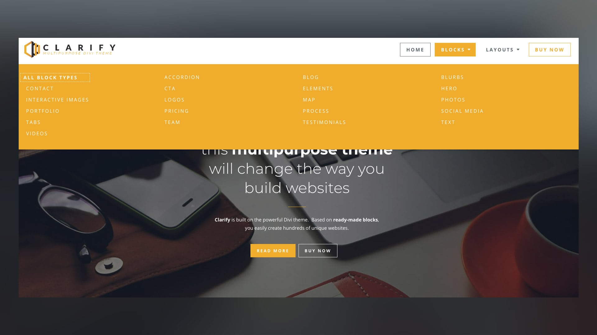
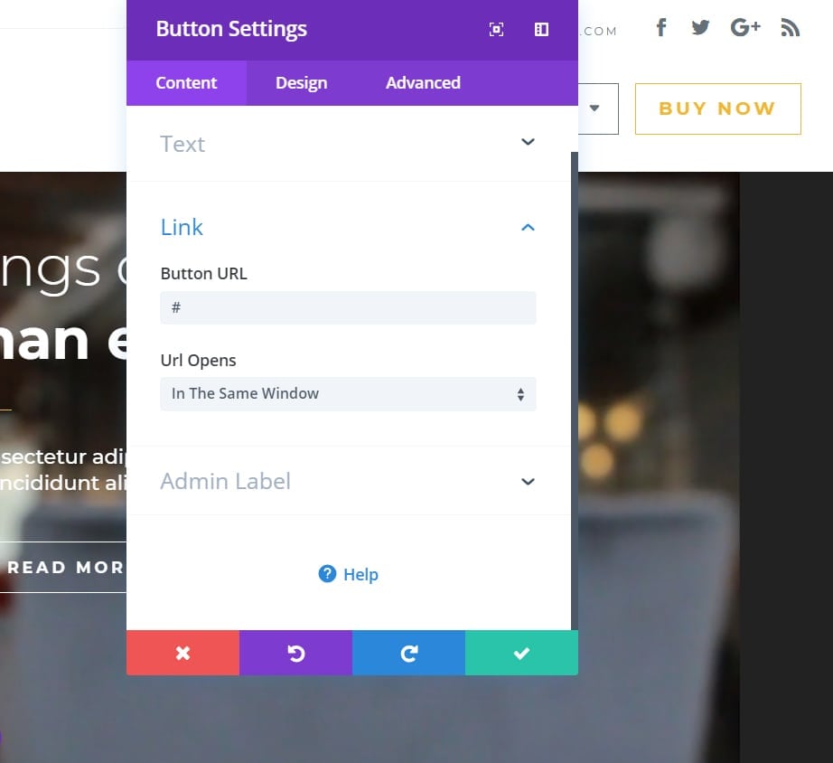
How to create/add the Mega Menu?
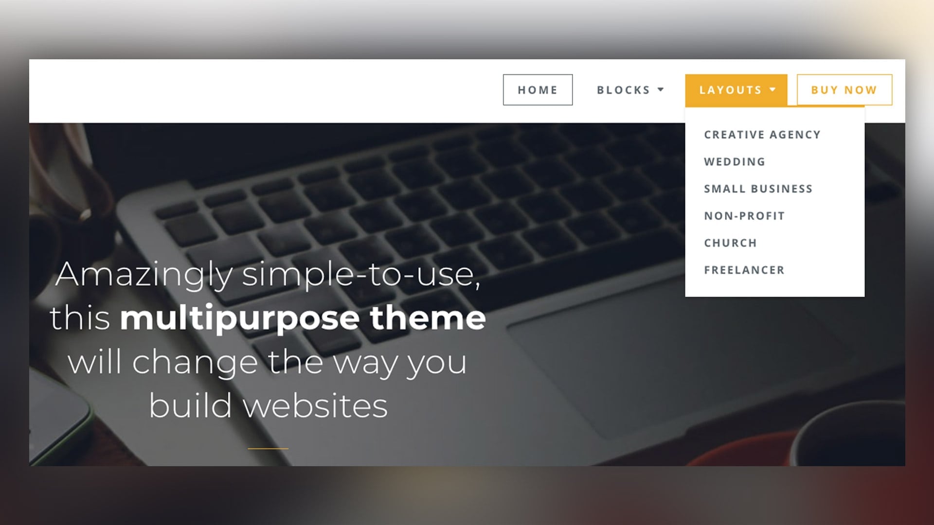
But with the simple addition of a CSS class you can have your menu look like this one:
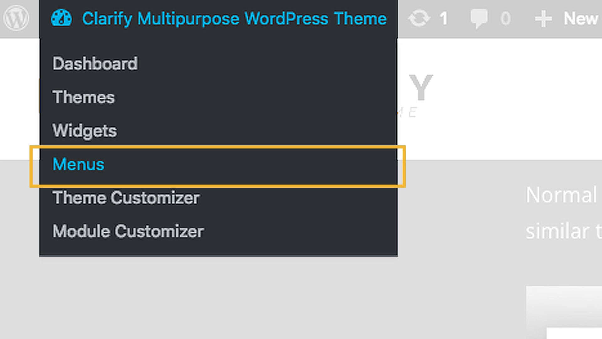
Go to Menu.
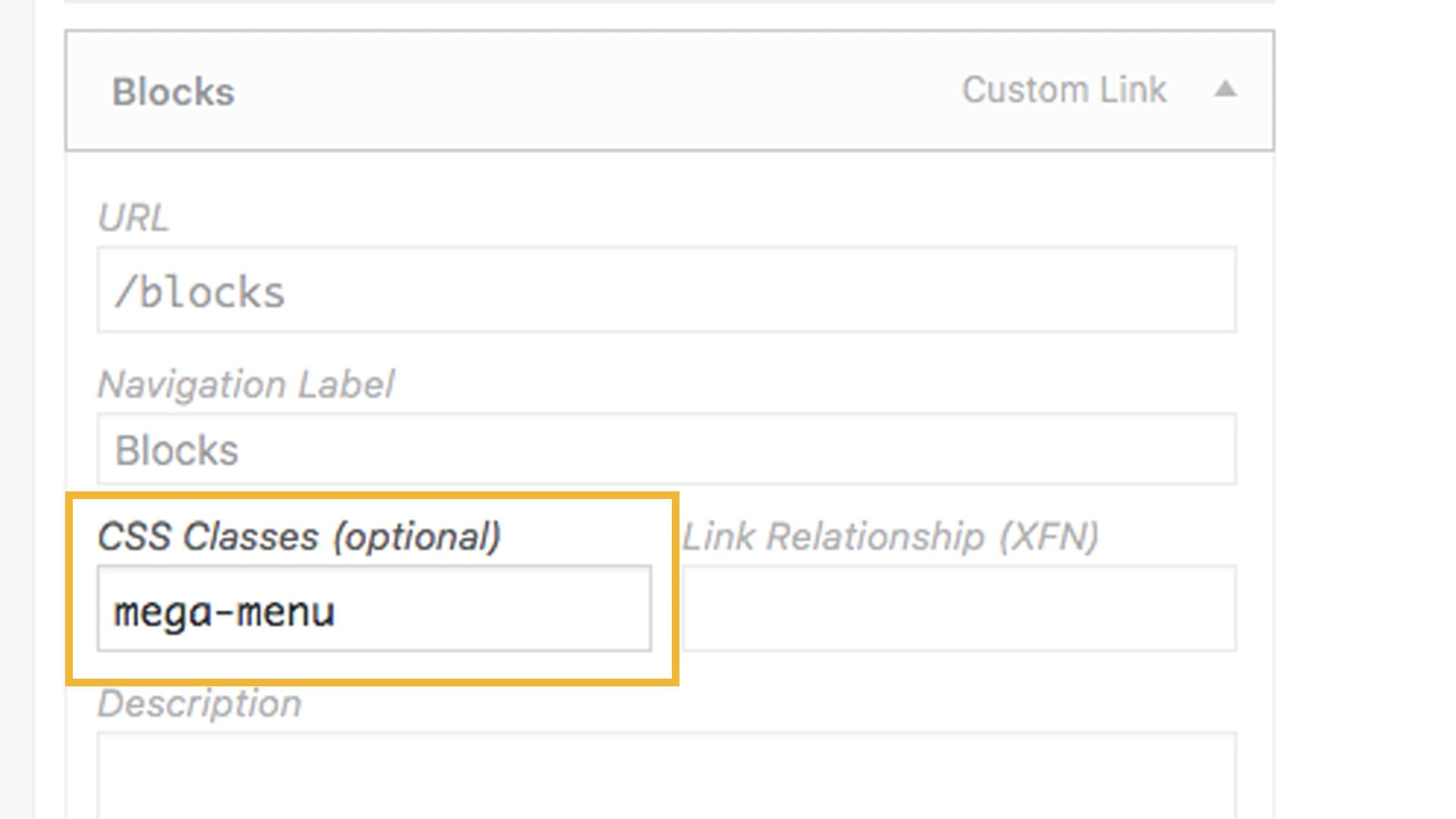
Add the class “mega-menu” to your Menu Item but make sure it’s a Custom Link.
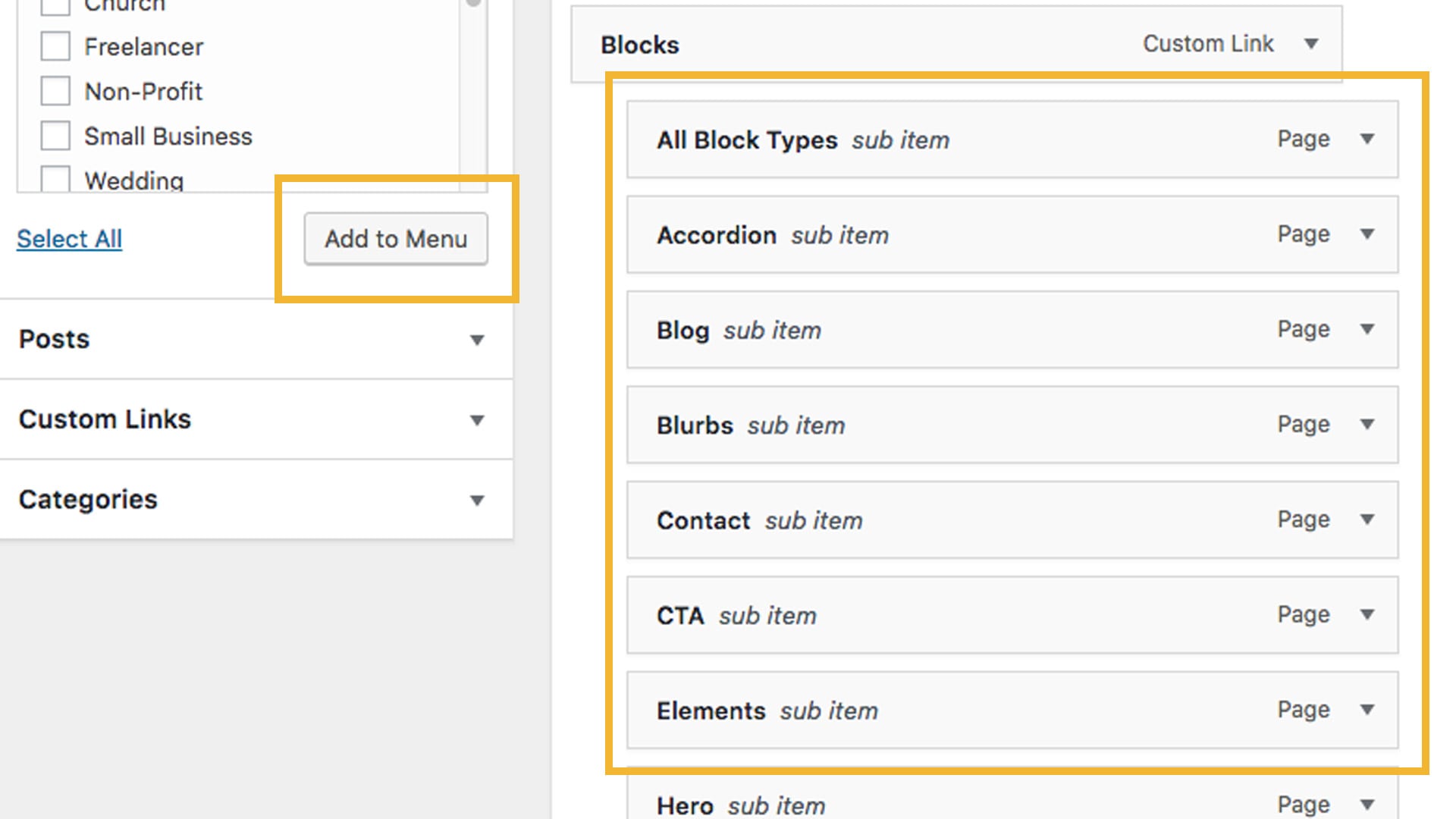
Add your sub-pages under the Main Page with this CSS class.
How to change fonts and colors from the theme?
To change fonts and colors, you need to go to the Divi Section on the left side and go to Theme Customizer -> General Settings.
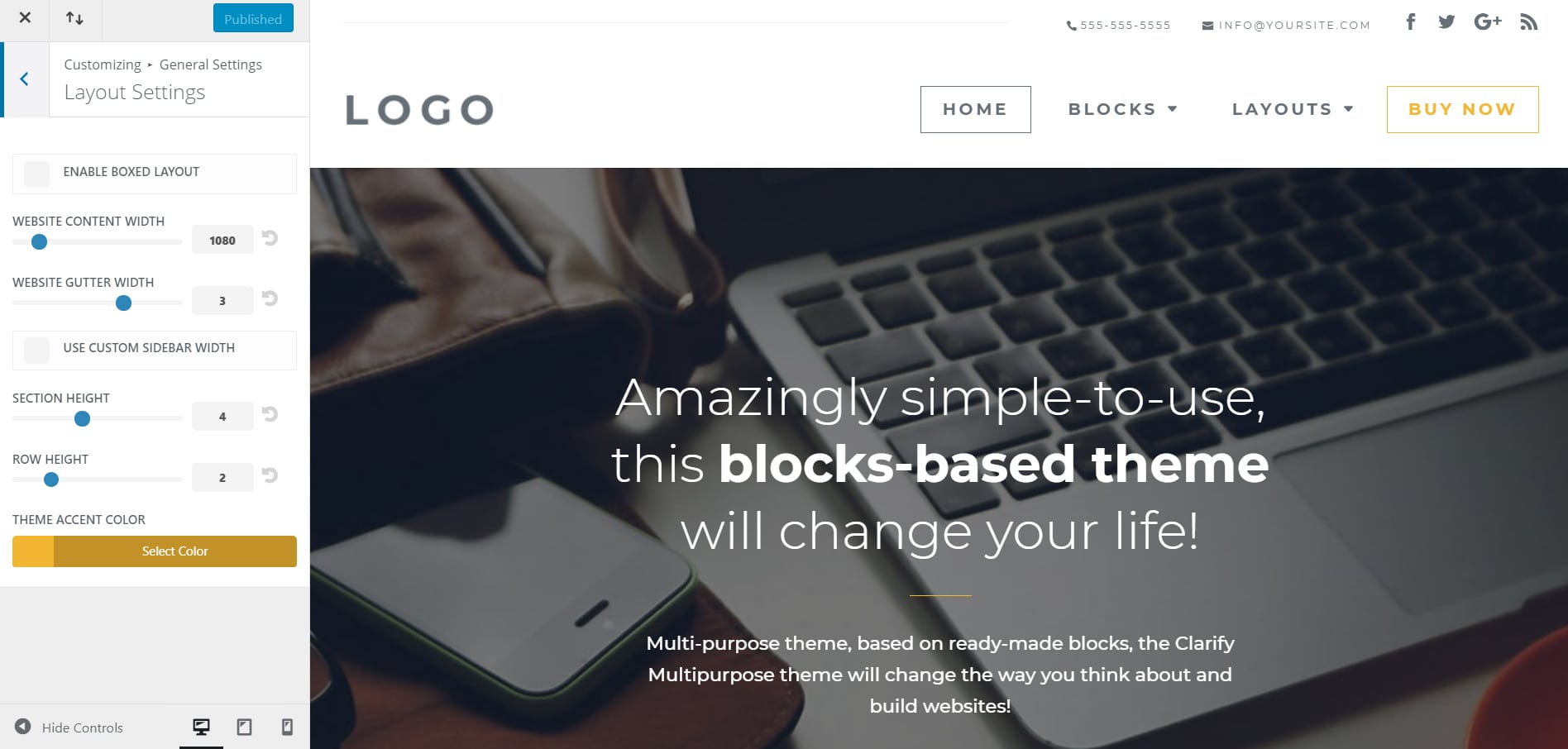
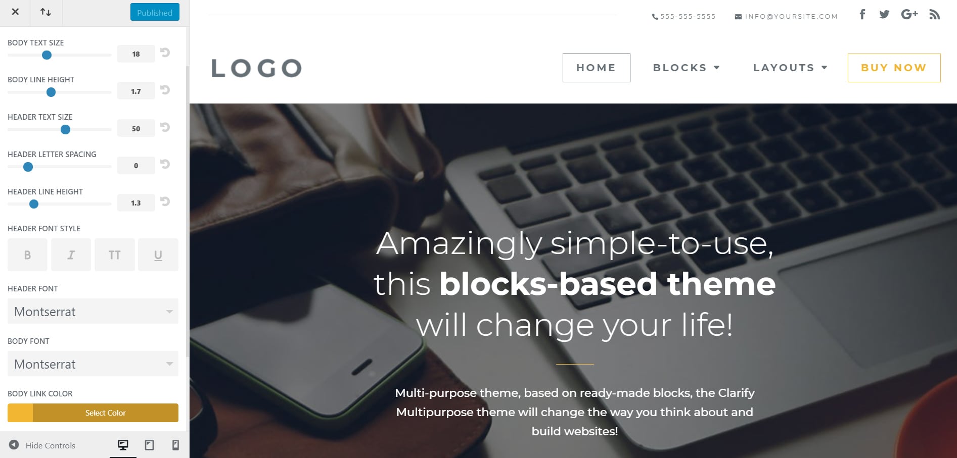
In the Theme Customizer there are some others sections, where you can define colors and other styles. We recommend to go through them all and customize each of them like you want to. After you finish with the Theme Customizer, there are a few elements that have colors or other attributes defined inline, you need to go through each page and change each element you want to suit your chosen color scheme, as long as you intend to keep those elements.
Lastly, there are a few CSS rules that might need to be looked at as well, we recommend to go in Apparence -> Editor. This is the place where you can edit CSS and change some element colors and styles. If we are speaking about colors, we used #f2b632 – yellow as a default color, we recommend to search for it through CSS and replace it with the color you want.
How to customize a Layout?
Changing Icons
1. Edit the page and find the icon you want te to change. For blurbs with icons, we recommend to use SVG icons. You can use SVG files uploaded as regular images. The theme has an integrated function that transform those SVG files in real SVG icons. With that function they act like icons, you can change their color in their active or hover state. In style.css we added some rules that change colors on those icons.
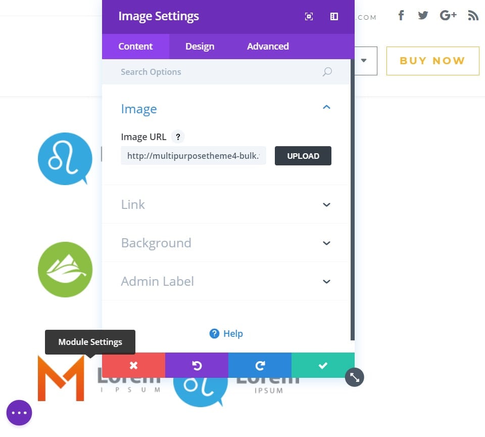
Changing Images
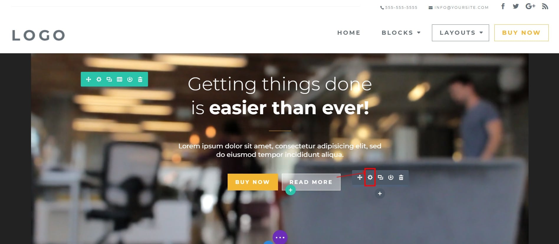
1. Edit the page with the layout you want to change and find the image you want to change.
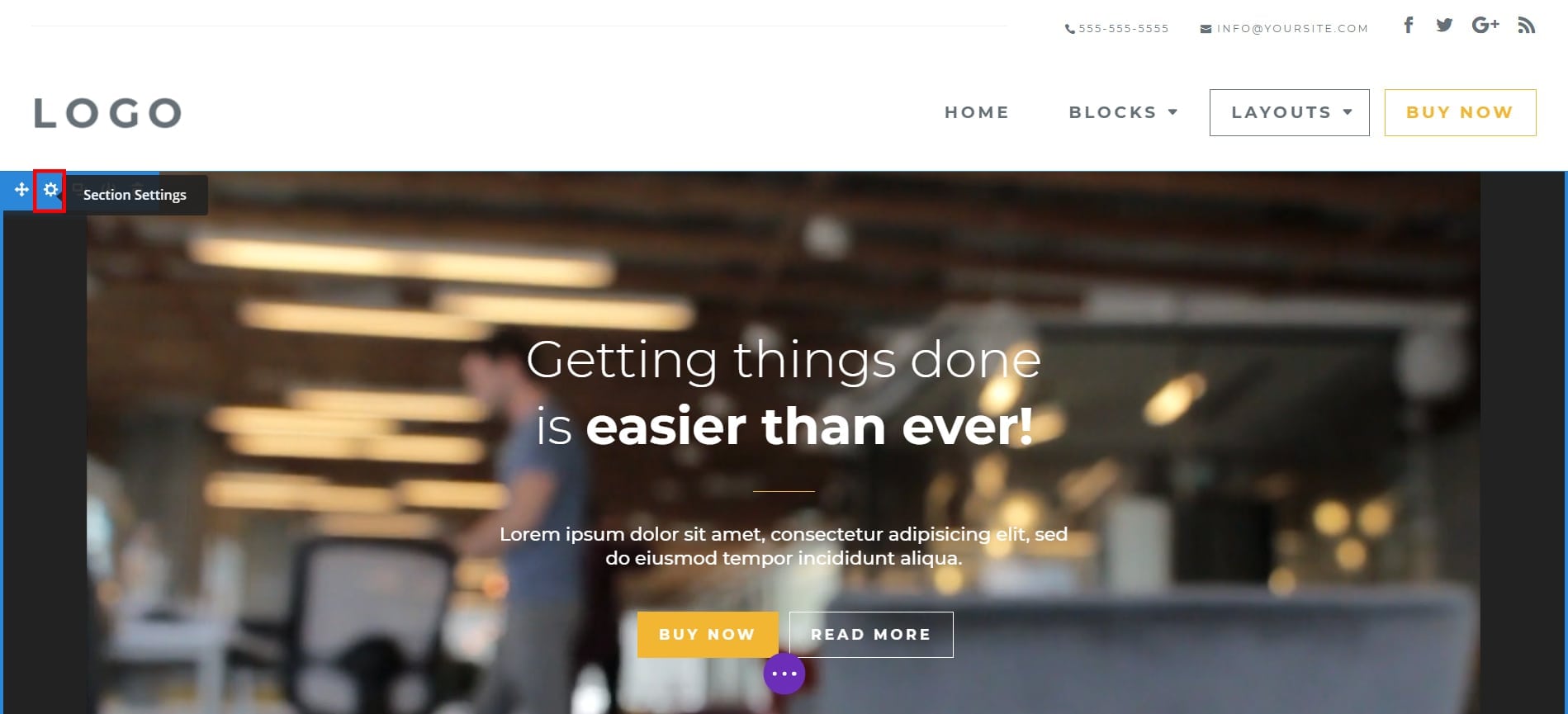
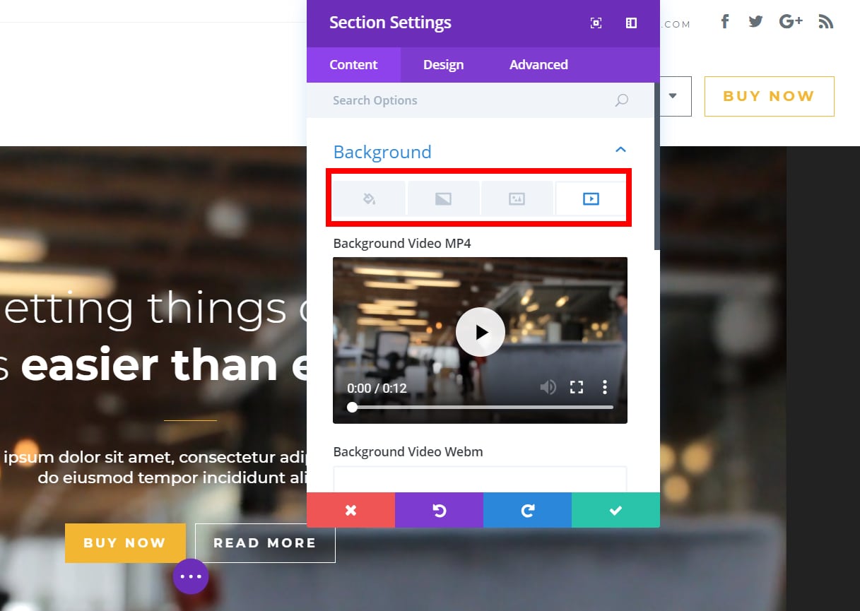
Changing Backgrounds
1. Edit the page with the layout you want to change and find the section you want to change the background for.